
You’ve been in a meeting where someone says, “We need more data,” and kills all the forward momentum. They don’t (always) intend to be that guy, but they are, and, since they’re importing a standard that is actually legitimate and necessary in other contexts, it’s hard to overcome the objection. Your museum isn’t running clinical trials where people could die if something goes wrong.
Data about your users is important, but it doesn’t have to be perfect. Because the decisions you’re making are important, but they don’t have to be perfect. We tend to treat too many decisions as one-way doors that, once walked through, can’t be reversed.
Aligning your museum around the outcomes it supports is important, but you don’t need 90% of your staff to weigh in to make that decision. (How many people were really involved in your last strategic planning initiative? Did you have 95% of staff in the room at all times?)
A grumpy voice in my head initially made the same objection when I started building something new this week. We’ve got a cluster of museums deploying the Outcomes Assessment, and I’ve been working on individual dashboards that members can pop into to see up-to-the-minute updates — number of responses, a live-updating preview of their alignment map, and moment-aware guidance at various stages of the process. I like showing work in progress, so here’s the current snapshot of a prototype dashboard for one of those museums:
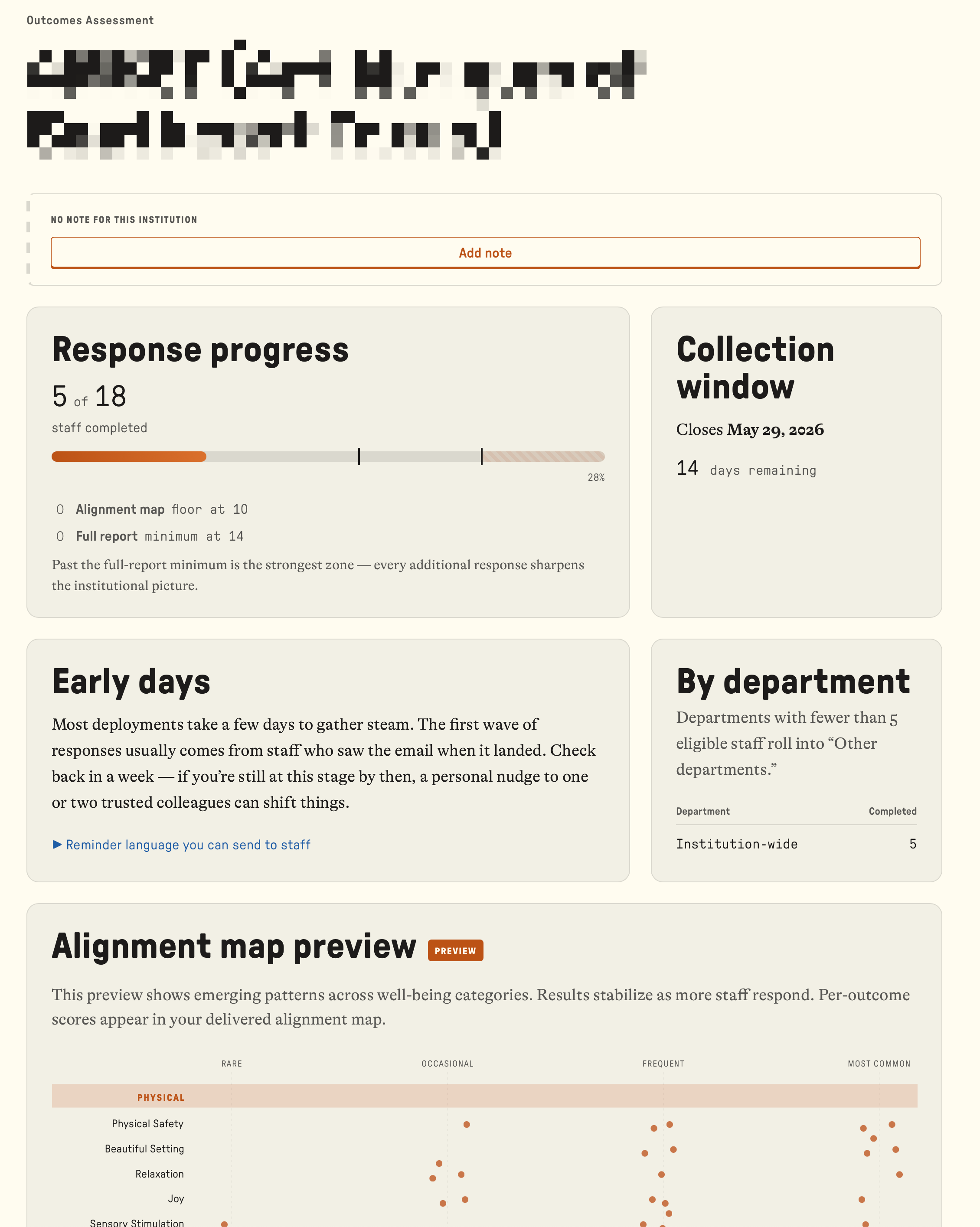
The grumpy voice said, “You can’t do that. It’s misleading to present the results of a survey when there are only a few responses.” He’s not wrong, but he misses the point. The purpose of the assessment isn’t to be right or wrong — it’s to initiate a different kind of conversation within the museum. A participant who is tuned in and invested in the results as they unfold may be necessary for that conversation to begin.
I call this the Chia Pet Principle. The point of getting a Chia Pet is to watch it grow. You don’t order a Chia Pet, wait for it to sprout, and have it delivered fully grown. If the makers of the Chia Pet had done that, they would never have developed the ad with the jingle that I’ll carry with me to the grave. No one wants that version of the Chia Pet. So, the dashboard is a way for participants to see the results of their efforts unfold in real time.
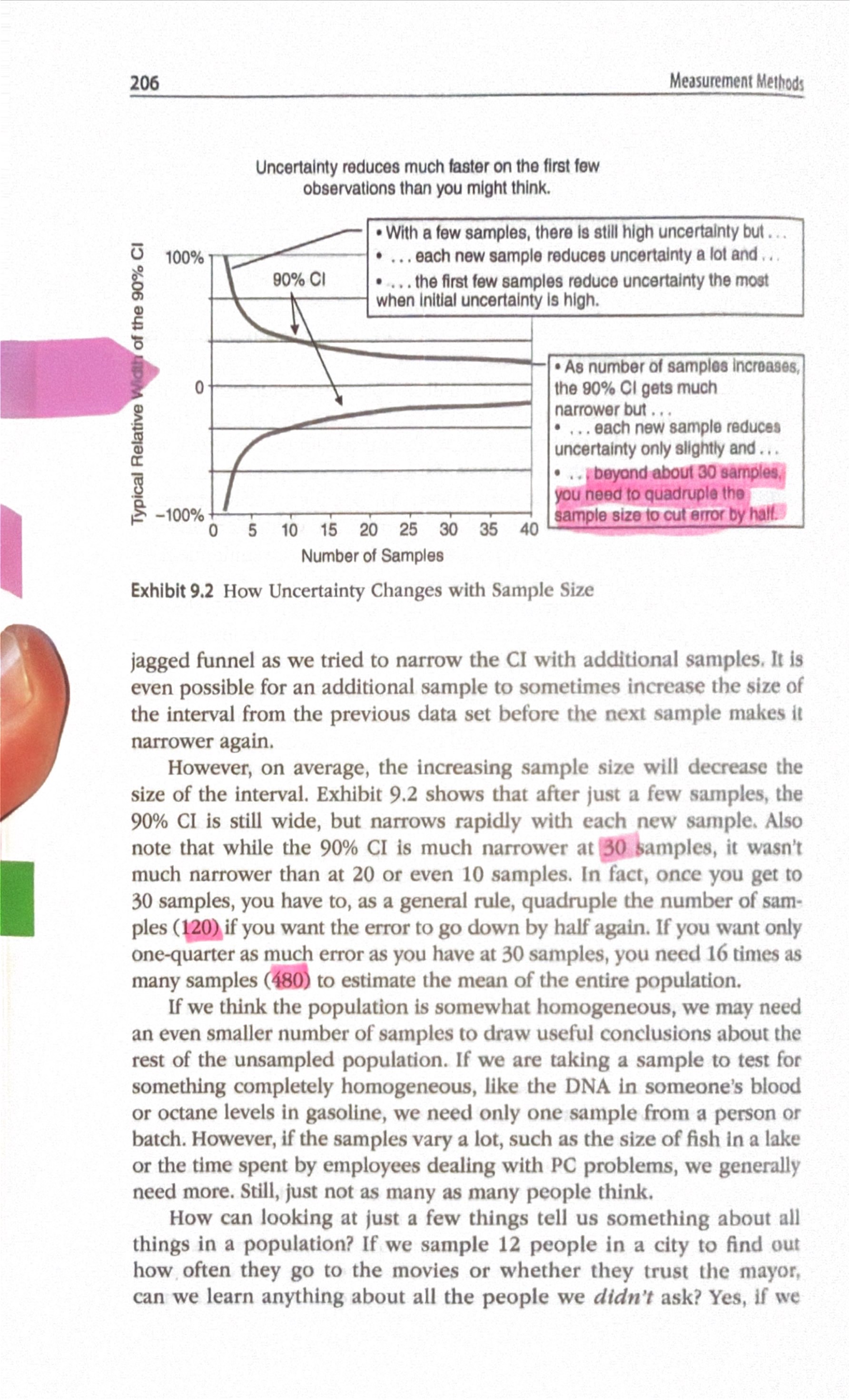
A small number of observations does most of the work. Douglas Hubbard demonstrates this in How to Measure Anythingwith a chart that I’d like to have framed and hung above every director’s desk:
(The framed version for directors may or may not include my thumb. Undecided.)
The 90% confidence interval narrows rapidly with the first few observations. By the time you reach about 30, the curve has flattened. Past that point, you’d need to quadruple your sample size to halve the remaining uncertainty. 30 to 120 to 480 … each step buys you far less than the one before.
So, your first ten responses are often the most valuable. The difference between zero observations and ten is enormous. Between ten and fifty, still real but smaller. Between fifty and two hundred? Rarely changes what you’d actually decide.
Sample size is a decision-relevance question. The right question isn’t “how many responses do we need for statistical significance?” It’s “what would change if this number moved five percentage points either way?” If your team’s alignment map shows strong consensus around three outcomes and that consensus wouldn’t shift with twenty more responses, additional precision is just overhead — more work for the staff member trying to get this thing deployed.
Similarly, ten listening sessions put you at the steepest part of the curve — where each conversation teaches you the most. Beyond that point, additional precision is disproportionately costly and rarely changes the decision you’d make.
Most museums that say they need more data actually need less — but sooner.
P.S. If you want to see what your institution’s alignment map looks like, start here. Or just reply to this email.